- Mark as New
- Bookmark
- Subscribe
- Subscribe to RSS Feed
- Permalink
- Report Inappropriate Content
01-14-2022 06:42 PM in
Galaxy S


- Tags:
- oneui4
- Mark as New
- Subscribe
- Subscribe to RSS Feed
- Permalink
- Report Inappropriate Content
01-15-2022 09:23 AM (Last edited 01-15-2022 09:24 AM ) in
Galaxy S
- Mark as New
- Subscribe
- Subscribe to RSS Feed
- Permalink
- Report Inappropriate Content
01-15-2022 09:35 AM in
Galaxy S- Mark as New
- Subscribe
- Subscribe to RSS Feed
- Permalink
- Report Inappropriate Content
01-15-2022 09:43 AM in
Galaxy S
- Mark as New
- Subscribe
- Subscribe to RSS Feed
- Permalink
- Report Inappropriate Content
01-15-2022 10:55 AM in
Galaxy S- Mark as New
- Subscribe
- Subscribe to RSS Feed
- Permalink
- Report Inappropriate Content
01-14-2022 08:24 PM in
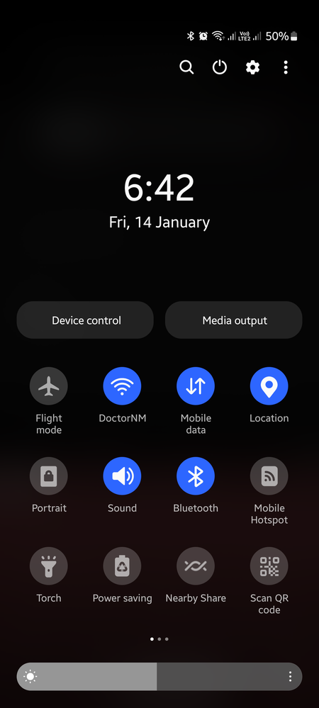
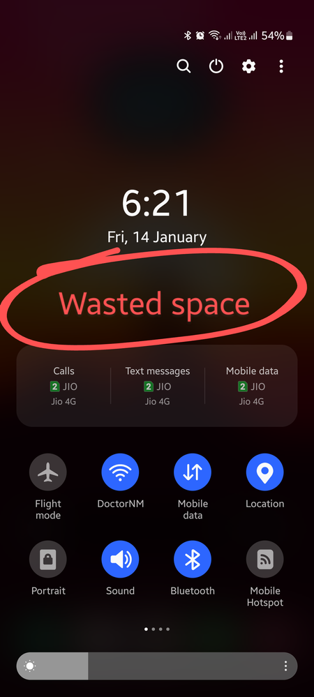
Galaxy SBut still it looks odd and less convenient than before the update. So much space is wasted just for that multi sim box.
It would be much more appealing and organized if they adjust the dimensions of the sim switching boxes similar to that of the device care buttons.

- Mark as New
- Subscribe
- Subscribe to RSS Feed
- Permalink
- Report Inappropriate Content
01-14-2022 08:27 PM in
Galaxy SThey should work on this though.

- Mark as New
- Subscribe
- Subscribe to RSS Feed
- Permalink
- Report Inappropriate Content
01-14-2022 09:54 PM in
Galaxy S- Mark as New
- Subscribe
- Subscribe to RSS Feed
- Permalink
- Report Inappropriate Content
01-14-2022 10:31 PM in
Galaxy SOne UI has always been one-handed user friendly.
- Mark as New
- Subscribe
- Subscribe to RSS Feed
- Permalink
- Report Inappropriate Content
01-14-2022 11:01 PM in
Galaxy S- Mark as New
- Subscribe
- Subscribe to RSS Feed
- Permalink
- Report Inappropriate Content
01-14-2022 11:57 PM in
Galaxy SI use dual sim and switch very frequently. So that's an option I always have to keep enabled.
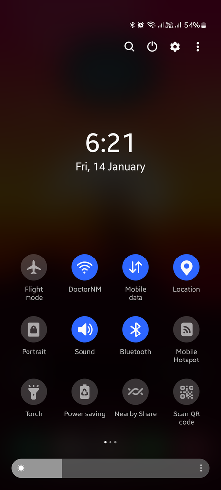
After one ui 4 update, I was dissapointed by the unnecessary cut down of buttons, I disabled the device control and media output in hopes of more buttons but to no avail. Now after reisizing the button grid to max width, I have to make do with 2 less buttons per page. Which is a bummer for me.
