sanu2k
Active Level 8
Options
- Mark as New
- Bookmark
- Subscribe
- Subscribe to RSS Feed
- Permalink
- Report Inappropriate Content
05-11-2020 10:31 PM (Last edited 05-11-2020 10:51 PM ) in
Tech TalkLight-on-dark color scheme


Screenshot of one dark mode.
Light-on-dark color scheme, also called dark mode, dark theme or night mode, is a color scheme that uses light-colored text, icons, and graphical user interface elements on a dark background and is often discussed in terms of computer and mobile user interface design and web design.
Originally, computer and mobile user interfaces (UI) were formed on CRTs. The phosphor was normally a very dark color, and lit up brightly when the electron beam hit it, appearing to be green or amber on black, depending on phosphors applied on a monochrome screen. RGB screens continued along a similar vein, using all the beams set to "on" to form white.
With the advent of teletext, research was done into which primary and secondary light colors and combinations worked best for this new medium. Cyan or yellow on black was typically found to be optimal from a palette of black, red, green, yellow, blue, magenta, cyan and white.
The opposite color scheme, dark-on-light color scheme, was originally introduced in WYSIWYG word processors, to simulate ink on paper and became the norm.
While the debate of whether it is easier or healthier to read text on a dark background was disputed by vision and perception researchers, there was similar dispute between users.
A 2018 article by Popular Science suggests that "Dark mode is easier on the eyes and battery and displaying white on full brightness uses roughly six times as much power as pure black on a Google Pixel, which has an OLED display."
Properties:
Understanding Contrast Related Link arrow_downward Material Design dark themes are defined by the following properties:
Material Design dark themes are defined by the following properties:
- Contrast: Dark surfaces and 100% white body text have a contrast level of at least 15.8:1
- Depth: At higher levels of elevation, components express depth by displaying lighter surface colors
- Desaturation: Primary colors are desaturated so they pass the Web Content Accessibility Guidelines’ (WCAG) AA standard of at least 4.5:1 (when used with body text) at all elevation levels
- Limited color: Large surfaces use a dark surface color, with limited color accents (light, desaturated and bright, saturated colors)
How to use:
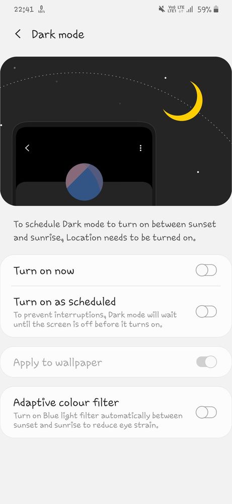
In Settings, people can choose Dark Mode as their default interface style and schedule automatic changes between the appearance modes. Because people make these choices at a systemwide level, they generally expect all apps to respect their preferences.There is in notification panel and you can go through settings > Display > Dark mode
Compare of some dark mode


There are also schedule dark mode which is also applicable to use dark and light theme as scheduled time.
To reduce eye strain there is also adaptive colour filtering system..

The benefits of dark mode
●Health & well-being
●Looks amazing
● Battery saving
●Reduce Eye Strain
2 Comments
Ařpît
Expert Level 2
Options
- Mark as New
- Subscribe
- Subscribe to RSS Feed
- Permalink
- Report Inappropriate Content
05-15-2020 10:54 PM (Last edited 05-15-2020 10:56 PM ) in
Tech Talk
nice and well explained post 👌👍
have a look at mine too🙂
https://r2.community.samsung.com/t5/Tech-Talk/Dark-Mode-Explained-GalaxyTechfluencer/td-p/4331748
have a look at mine too🙂
https://r2.community.samsung.com/t5/Tech-Talk/Dark-Mode-Explained-GalaxyTechfluencer/td-p/4331748
sanu2k
Active Level 8
Options
- Mark as New
- Subscribe
- Subscribe to RSS Feed
- Permalink
- Report Inappropriate Content
05-16-2020 06:43 AM in
Tech Talk
ok thanks
